
No-Land
An irreverent fashion brand built on social.
Branding | Social Content | Naming | Photography Direction
When the founder and lead designer of No–Land came to us, he had been experimenting with unusual fabrics, textures, stitching processes, rubber-dipped shoes and fluorescent pullstrings. The No–Land brand identity needed to live up to the same principles of his creative process. Needless to say, we spoke the same language of creativity and pushed typography and imagery into new territory.

A logo built for mirrors
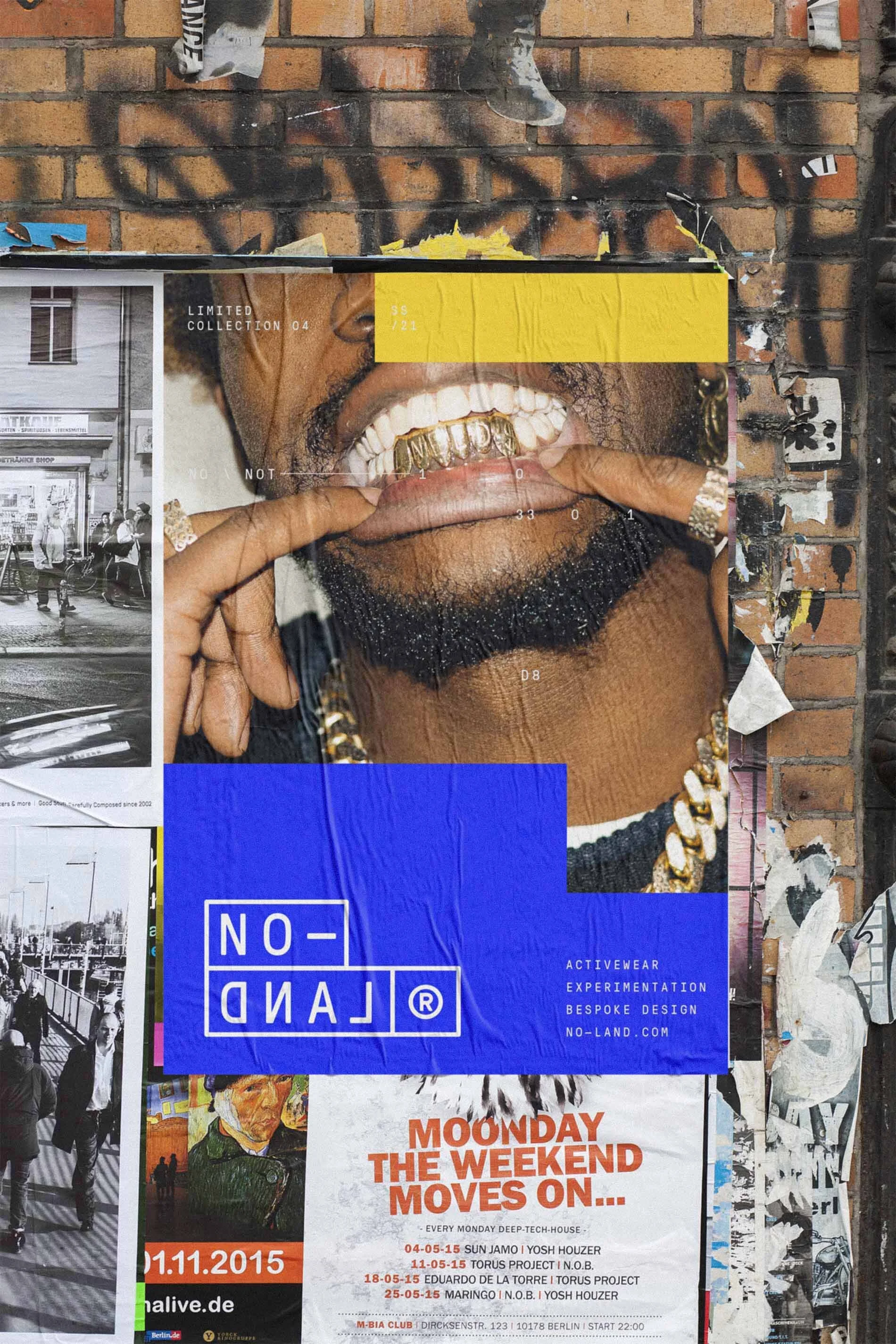
We designed the logo so that it could look unusual both on clothing, and when looking in the mirror. In each instance, only one word is legible.


Art direction for all photography
Inspired by fabric swatches used in the clothing line, as well as the art of Piet Mondrian, we created a limited color palette that is bold and instantly recognizable. Each photograph was intentionally geometric and rigid in its composition, so each image could stack and make larger compositions on social media grids when shown together.

Our solution
With typography that behaves similarly to Dadaist poetry and a stuttering typewriter, we created a bold visual system that is as bespoke as the clothing itself.
Team credits
Client: No–Land
Fashion Designer: Connor Carrara
Brand Identity & Art Direction: Photon Factory
Photography: AJ Ragasa